For any size of the organization, business intelligence tools are necessary to make the smart decisions and to have the edge over the competition. IBM Watson Analytics is a robust cloud-based tool that facilitates this purpose offering features like smart data discovery, visualization and predictive analytics from your business data.
I was looking for analytics solution for a small business that does not require any third party developer or data scientist to deploy or manage and provide me quick insights of available data. Watson Analytics served the exact purpose with affordable pricing tiers. It was easy to connect or upload my business data, and within few minutes I was able to discover the valuable insights that assisted in producing confident business decisions.
To get started with this tool, you can sign up to Watson Analytics for a free trial or pay for the monthly subscription for ongoing use.
Note that you do not have to be a data scientist or analytics expert to use this tool, as it has the Watson Intelligence layer built in with Natural Language Processing, so you can just type in questions in natural language. All you need is an excel sheet of your business data, or you can connect your relational sources such as DB2 directly to this platform. Let’s visualize the business data step by step.
Let’s visualize the business data step by step.
Visualize Your Business Data With Watson Analytics
I am using one of the sample data set of the super store, that serves corporate, small business and home office customers. But before I import the data, let me introduce you to the interface of Watson Analytics.
The dashboard is divided into three major segments: Data, Discover, Display.
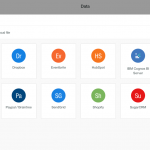
Data
Data lets you import the local or connected data from most used platforms like Marketo, Hubspot, Dropbox, etc.

Once imported, the dataset is processed to measure the data quality.
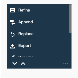
You can click on the three dots on the dataset to open the refine options, and you can further clean up your data, like changing table names, sort style, sort methods, and toggle predict drivers. For now, let’s keep everything as it is.
At this stage, you can download the sample dataset and import it as a Local file, and give Watson a minute to process the data.
Discover
With the provided data sets, Watson Analytics is immediately ready to provide you business intelligence data, and let’s see how it works out for our superstore data.
All you have to do is now click on on the data set icon, and you will be presented with starting points (natural language questions) for your data. This feature is available under the discover as well as data tab, which finds problems and opportunities available based on your business data.
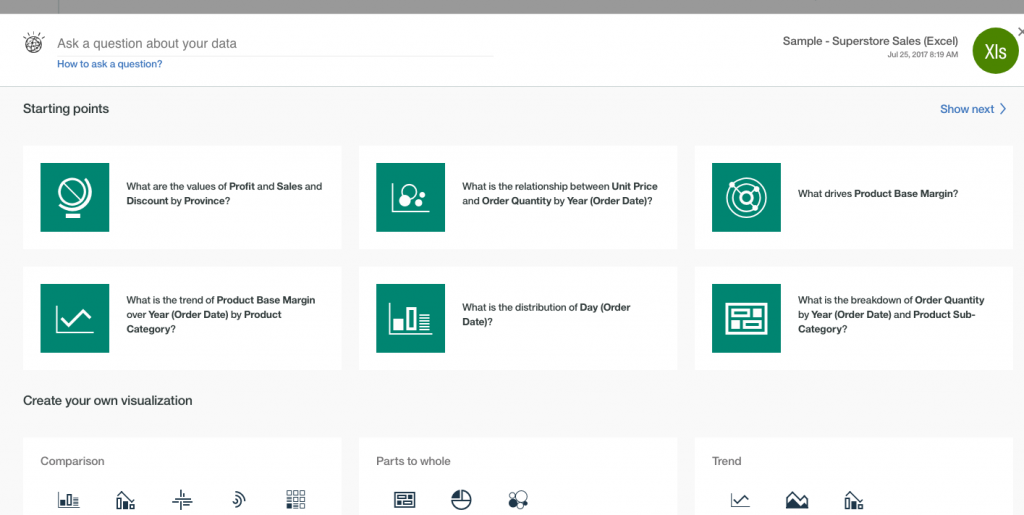
You can click any one of the starting points or ask a question like ‘How do the values of sales compare to the product category?
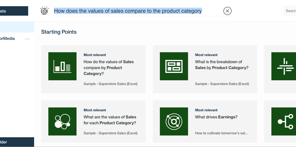
If the question doesn’t perfectly fit the data set values, it will show you the most relevant starting point, and you can click on it to create your very first visualization.
And here is the simple result of which products sales the most by category.
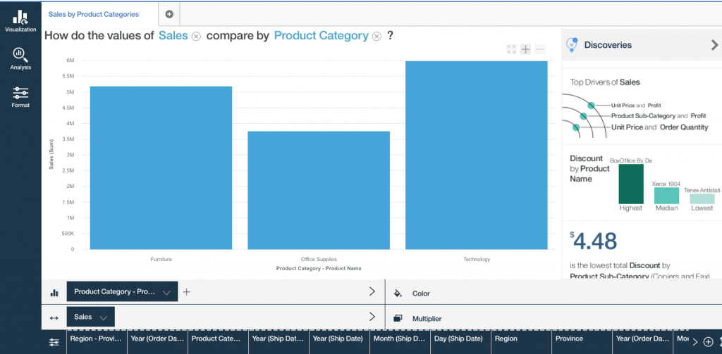
The sales and product categories button on click offers you options you can change, and see instant result of changed data or multipliers.

At the end of the visualization, you get to play with a number of data points on the dynamic discovery bar to further refine your business intelligence and get instant visual insights for a particular date, category, geographical area and so on.

Based on if data is a comparison, predictive analysis or a decision tree, having a variety of visualization makes a big difference in understanding the business intelligence data provided. To facilitate this, you can click on Visualization tab on the left sidebar, and use a variety of graph visualizations like the following.

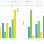
Above ds was a straightforward visualization of the data, let’s see if Watson Analytics can show us how discount numbers has affected profits in various geographical regions.
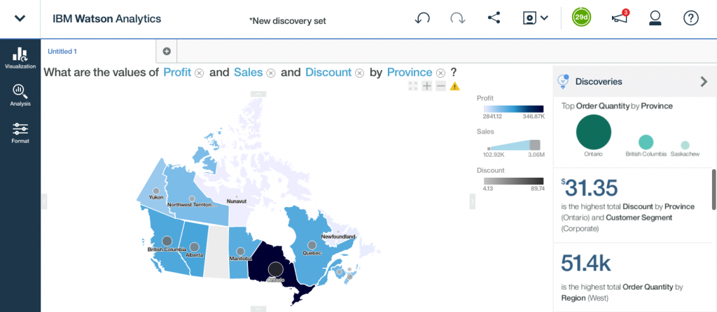
As you can see, Ontario region has gained highest profits as the discount values were the highest at this location. Alternatively, earnings and sales were lowest where the discount was low.
On the right side, you get detailed infographics style insights, helping you make sense of data even faster. Every time you create these discoveries, make sure you use the save option on top-right, to save it in a simple folder structure all of us are familiar with.
With a plethora of data refinement options, you can dig deeper into the business data you have, and discover opportunities by location, product, workforce, and whatnot.
A fun exercise for beginners on Watson Analytics platform could be this sample data set of all Indian Premier League matches – This is the ball by ball data of all the IPL cricket matches till season 9.
Conclusion
Watson Analytics makes it incredibly easy for any size of businesses to get in-depth insights from their data, provide more value to their customers and grow the business.
Data visualization allows you to take informed decisions while planning the biggest store discounts, or building your local marketing strategy or even to calculate the productivity of your workforce.