As the human resource is the backbone of any modern business, the role of HR managers demands in-depth analysis of top performing employees and attritions that are driving them to stay with the company. If you’ve been following up our introduction to Watson Analytics series of articles, this is for the first time we are using Watson Analytics Platform to demonstrate its capabilities primarily for the HR analysts.
In our sample dataset, we have a range of data about employees from compensation, performance, whether they are still with the company or not and more. The goal of the following analysis is to identify the top reasons employees retain at the company.
Retaining Top Performing Employees with Watson Analytics
Step 1:
Login to Watson Analytics platform, if you have not registered already sign up for a free 30-day trial account here:
Step 2:
Download the sample dataset with factors like hourly, monthly compensation, years of working, promotion and more relevant data.
Step 3:
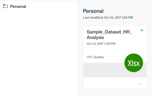
Upload the sample data and click on import. You can improve the data quality of your dataset, by using the refine feature available on Watson Analytics platform. To learn more about how to import and refine data click here to read my last blog post.
Now, you should click on the name of the dataset to get a list of starting points as discoveries.
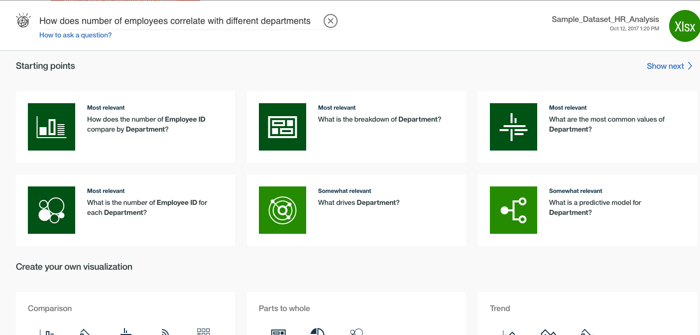
You can click on any one of the relevant starting points from the list, or ask Watson Analytics any of your questions in natural language in this platform.
Step 4: Where the attrition is significant?
Let’s find a correlation between the number of employees with different departments. After I have asked the question, I received some suggested discoveries with most relevant content and suitable visualization.
Here I will select the most relevant insight with a simple graph visualization, so I can modify the filters and get more granular data. Let’s add one more filter to understand the correlation of the attrition in the different job role types.
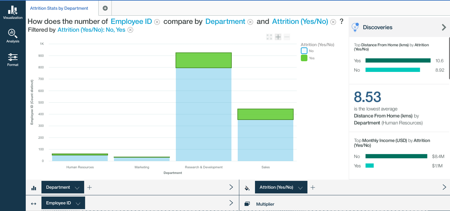
So now we are comparing Job Roles, Employee Count & Attrition, and within seconds I can see my visualization being modified. I can either save this discovery and prepare few more relevant discoveries to collect insights of the similar sort.
Step 5: What impacts the attrition?
The new modified graph shows me which departments have higher attrition (Research & Development), and as the HR analysts, I now want to dig deep into the data, to understand why employees in those specific departments are leaving faster than the others.
In the most basic way now I am asking Watson Analytics a question “Help me understand what is driving the attrition.”
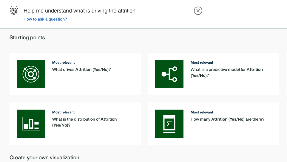
Now I am selecting the spiral visualization for Watson’s predictions and insights so I can better understand factors that significantly affect the attrition. The ones that are in the centre of the spiral has the most impact.
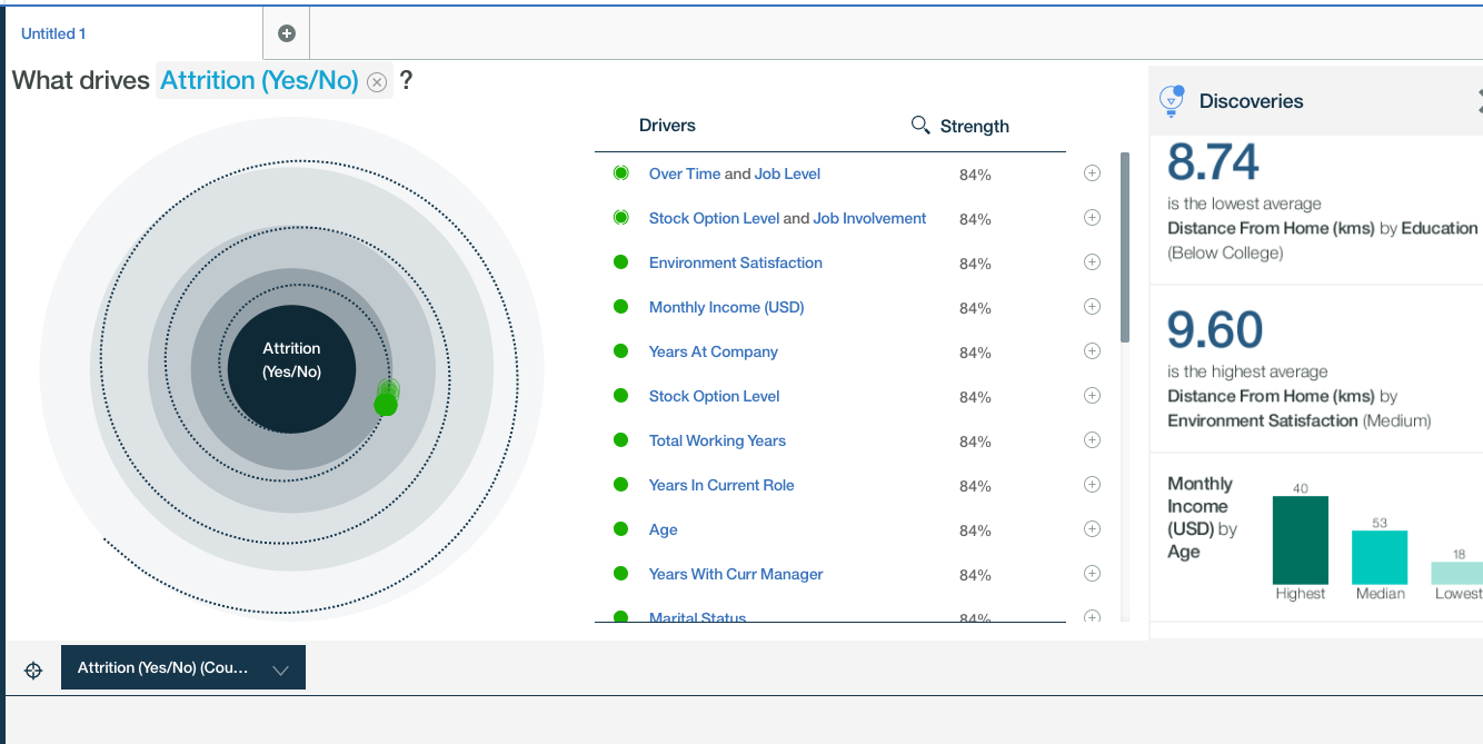
From this insight, I noted that Monthly income and Overtime at different job levels have a considerable impact on attrition. I can now filter data by combining with other filters and understand all of the essential factors deeply.
I am saving this discovery for sharing it further or using it to create a valuable display I can share with my colleagues.
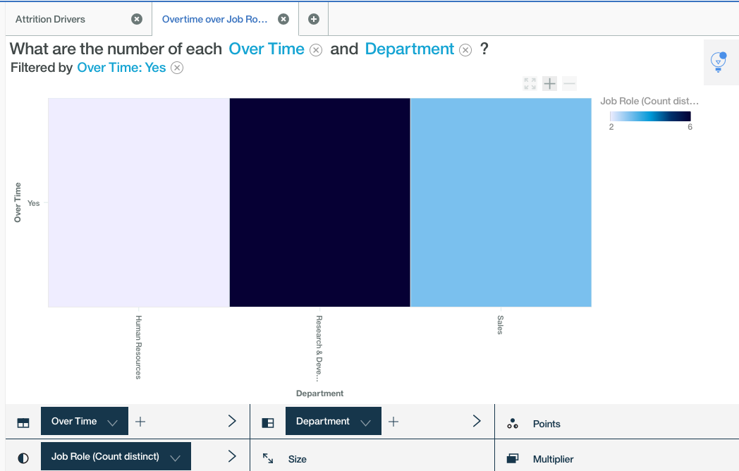
Next, I am interested in knowing more details of the employees that have already left our company and how much overtime has affected employees in various job roles. Using heat map visualization I can confirm that the over time is significantly high in the research and development role.
Step 6: Achieving Employee Retention
After having the understanding of what drives employees out of the company, I am interested in knowing more about employees like the monthly income, years of the company, overall experience or people awaiting promotion for more than three years.
This data is colour-coded in following crowded bubble chart, but it will help us understand which employees are we must retain. To bring clarity further lets only display high-value employees to the company by filtering triggers work experience or income etc.
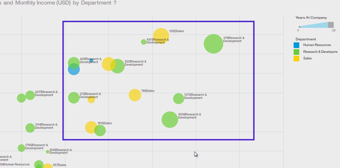
Now that we have a less cluttered view, we can immediately take actions that will prevent our highly valued employees from leaving our company. With further filtering and even adding more attributes will help the HR analysts identify the factors driving employee attrition and suggest the possible measures, we can take to avoid high-value employees leaving the company. Note that each employee ID in the highlighted area of the heat map is a valuable employee to retain.
Conclusion
Once you finish your discoveries, You can further make it more presentable by collecting relevant discoveries in the display feature of Watson Analytics, that can also be shared with colleagues and other relevant departments. You can learn more about creating visualization and sharing display in one of my previous blog posts here.

